How effective is the combination of your main product and ancillary texts?
The collaboration between our poster, magazine front cover and our horror teaser trailer all link in with each other to create a brand and all have a very similar effect and appearance to our audience.
COLOUR SCHEME
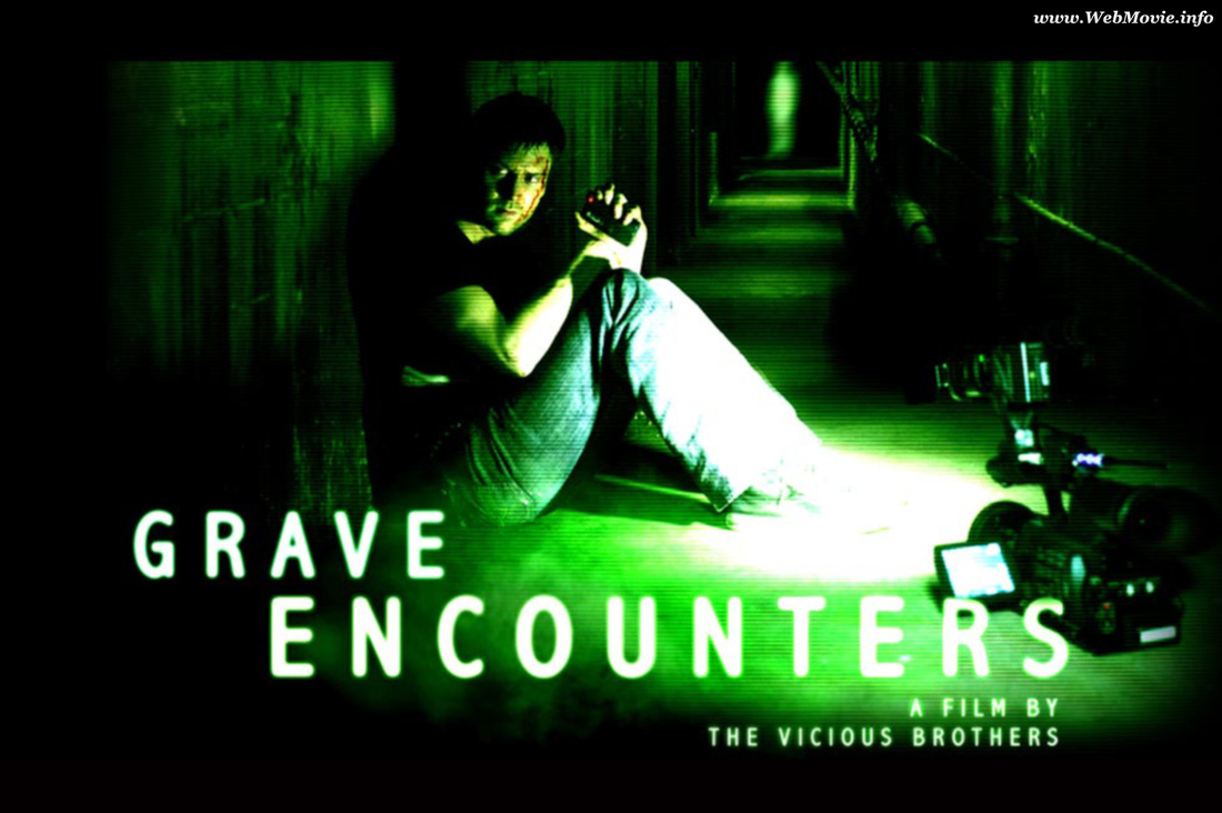
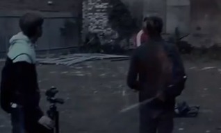
The first aspect of our poster, our magazine front cover and our horror teaser trailer is the very faint colouring with green. In each of our different parts of our project, we have some sort of the same coloured green on all of our project parts. We have used green in our project because it creates a sense of poison and discomfort within our audience. it makes for a more suspense and anticipated nature within our poster, our magazine front cover and our horror teaser trailer. We again have taken influence from Grave Encounters, we liked the suspense that Grave Encounters shown when they were filming. The green lighting made the horror look more terrifying and gloomy and that made it uncomfortable for their audience when released in the cinemas. We want this effect on our audience so we have decided to pay homage to Grave Encounters to see this colour scheme and we feel it has been a success with all our products within our project.
|
|
ICONIC CHARACTERS
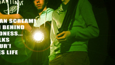
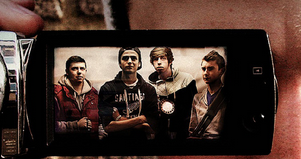
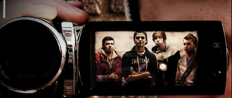
The four characters play their part in all the same parts of the project. All four characters in the camera screen in the poster. We felt that the picture was really effective and that it would have worked well with just our main character Brad standing in place with a camera, we felt that to improve this part of the project, we needed all four characters to be in the poster. Our next question was about where we would put us all in the poster as the face of Brad and the camera took up the whole focus of the poster. Then we decided that the best place for all of us to be in the poster was for us to be in the screen of the camera. After the results we knew that this was the right way forward for our poster to be up to A level standard.
|
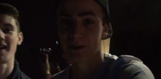
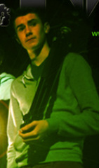
Stills from trailer of iconic boy shots
|
|
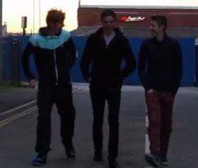
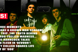
Poster image of boys- using sex to sell
Magazine image of boys- similar pose to show continuity in glamour shots
CONSISTENT FONT
We have decided to keep our font on our magazine, our poster and our trailer. We felt as though we needed to be consistant when putting our lettering on each different part of our project. Having different fonts on each of our different projects wouldn't have worked, we as a group decided this. We oringinally thought to have different fonts as we thought it would have been a bit more verified but Brad decided to have the same font and to see how well it would have worked, and it did so this was a good way forward for our project.

Magazine font
Trailer font
REPEATED ICONS
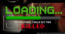
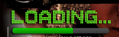
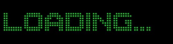
We repeated the image of the camera across our products to aslo help brand LOADING
|
Magazine image
|
Poster image
|
|
|
