Magazine Cover Analysis
Empire Analysis
Empire magazine is owned by Bauer media and is a magazine focussing exclusively in the release of new films and an in depth look at the film culture and history.
The age of most of empire’s readers are between the ages of 15-44 and most of them are male with 76% so the target audience is people from the age of 15 – 44 and should have texts, imagery and colours that appeals to the male stereotypes.
Bright colours and the shiny look gives this magazine the edge to make me want to buy it, its simple and has big writing around the edge to show that fact that it is important.
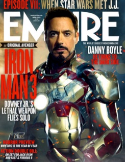
Iron man over the title “Empire” catches your eye and again shows that this magazine is important and the light background of the sky makes the magazine look like its more information about the movies than information or gossip.
The age of most of empire’s readers are between the ages of 15-44 and most of them are male with 76% so the target audience is people from the age of 15 – 44 and should have texts, imagery and colours that appeals to the male stereotypes.
Bright colours and the shiny look gives this magazine the edge to make me want to buy it, its simple and has big writing around the edge to show that fact that it is important.
Iron man over the title “Empire” catches your eye and again shows that this magazine is important and the light background of the sky makes the magazine look like its more information about the movies than information or gossip.
Total film analysis
Total Film is a UK-based film magazine published 13 times a year (every four weeks) by Future Publishing. The magazine was launched in 1997 and offers cinema, DVD and Blu-ray news, reviews and features. Total Film is available both in print and interactive iPad editions.
The website of Total Film is very unique as it has moving images and has a little clip of the film but its only a second to two seconds long which is not a lot.
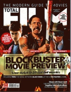
The magazine has created the cinema theme as they have put in the magazine a gold ticket to create the sense that its limited editon and that you should buy it now.
The website of Total Film is very unique as it has moving images and has a little clip of the film but its only a second to two seconds long which is not a lot.
The magazine has created the cinema theme as they have put in the magazine a gold ticket to create the sense that its limited editon and that you should buy it now.
'EMPIRE'
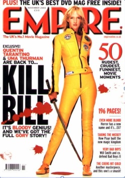
The protagonist character is shown in the middle of the magazine cover to attract the audiences attention to Bill. Her yellow costume shows a unique pairing towards the bold red font and also matches the blood theme.
The typography of the title KILL BILL’ is in bold black letters, to stand out from the splatter blood over it, suggesting the theme of the film is murder. Also to support this is the samurai sword.
The white background of the magazine makes the blood and the yellow tracksuit standout from the page.
The magazine mentions the director and actress, which implies that the film is a sequel. Under the title of the film contains an article about kill bill. The use of the word Bloody and Gory written in red links in with the theme of blood and murder.
'TOTAL FILM'
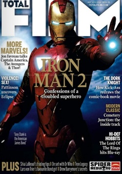
The main image is of Iron Man taken at a low angle shot making Iron Man seems more powerful and superhero like.
The title of the magazine ‘Film’ is short and memorable. ‘Total’ displayed in the F that gives it a stylish look to the magazine.
The background image of the magazine is of sky, to imply that iron man has the ability to fly.
The title ‘Iron Man 2’ is placed in the middle to ensure that the audience related the main image (iron man) to the text, as they are both the most appealing thing on the page.
'ENTERTAINMENT'
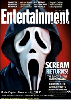
The main image is of the protagonist character ‘Scream’ with a front view image which grabs the attention of the audience. It takes up the whole of the front cover automatically reacts with the viewers and from the image you can tell that the genre of the film is horror.
‘Weekly’ displayed in the title ‘Entertainment’ to show that this magazine changes every week.
Above ‘Entertainment’ is shows what else is featured in the magazine.
The headline ‘Scream Returns’ advertising the piece with text underneath further explaining
‘Weekly’ displayed in the title ‘Entertainment’ to show that this magazine changes every week.
Above ‘Entertainment’ is shows what else is featured in the magazine.
The headline ‘Scream Returns’ advertising the piece with text underneath further explaining
"Child's Play 2"
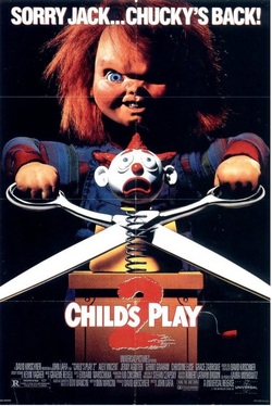
The way that dolls are a common feature in a child's life, makes this effective. Mainly parents would find this poster scary because they will go home, where their child has got a doll, this would creep them out because of the image that they have just seen.
The way the black background is there to create the effect of a dark room resembling horror with the red writing and the red doll to give the effect to the audience that it will be a gory movie which will attract the target audience because that is what they are looking for.
The way the black background is there to create the effect of a dark room resembling horror with the red writing and the red doll to give the effect to the audience that it will be a gory movie which will attract the target audience because that is what they are looking for.
'SKYFALL'
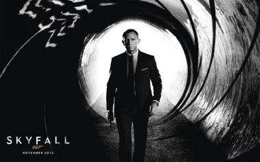
This poster showers the protagonist character 'James Bond' with a serious facial expression and body language suggesting that he is is confident and ready to kill.
The iconic sequence of the gun barrel, to show that is is heroic walking into the danger of death. The name of the film is written in capitals to add emphasis and to draw the audience in. This poster doesn't reveal anything to the story but the genre is pretty obvious due to the prop of the gun and the smart suit and colour choice; black and grey - that the genre is a action thriller. The iconic 007 logo, which is presented in all of the james bond films.
The iconic sequence of the gun barrel, to show that is is heroic walking into the danger of death. The name of the film is written in capitals to add emphasis and to draw the audience in. This poster doesn't reveal anything to the story but the genre is pretty obvious due to the prop of the gun and the smart suit and colour choice; black and grey - that the genre is a action thriller. The iconic 007 logo, which is presented in all of the james bond films.
'INCEPTION'
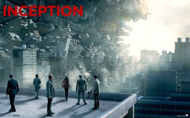
The building curving inwards looks like a huge wave. This shows that the film is about some sort of destruction All of the characters are facing the other way. This directly diverts the audience attention to the buildings - as the characters are nit making eye contact. Also the characters are very small in comparison to the buildings, focusing your attention more towards the buildings. Like the Skyfalls poster, the props and costume give an idea to the audience the type of genre to the film In this case the gun and suits give the impression that its an action thriller film.
'GRAVE ENCOUNTERS'
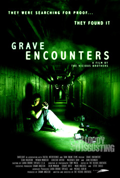
The main colour of the poster is black. This is because black is considered to be the colour of fear and danger. Furthermore it gives the audience the genre of the film due to the colours.
The movie credits are written at the bottom of the poster. The font is in white to stand out from the black and green background. The credits are written small, so not to occupy important spaces on the cover.
The main picture of the poster shows a scene from Grave Encounters. This gives the audience a sense of how the movie is going to look. It also shows the genre of the movie with the help of the colour choice of green and black.
At the top of the poster is a scary tagline "They were searching for proof...they found it!" This tagline is to scare the audience and to motivate them to watch the movie.
The title of the film 'Grave Encounters' is very visible in capital letters written in white in the middle of the screen, diverts the readers attention straight to the title.
'HOSTEL'
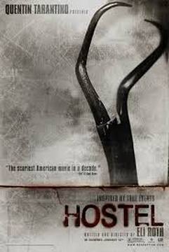
The background colour of the poster is grey/metallic and the shadow of the instrument (top right) indicates the darkness of the movie.
THe title of the movie looks as if its written in clotted blood - which suggests to the audience that it is a very gory film.
The main part of the poster is off-centre and aligned with the title. It draws the audiences attention to the right and down.
Additional information about the movie written in small, thin black font tucked in the corner so as not to distract from the aesthetic power of the poster.
The poster uses the same style as 'Saw' (2004) with use of different tones of grey and different textures to give of a metallic grey finish.
Angus Biggar & Bradley Holder
